Symbols matter. They’re more than just decoration—they hold meaning, invite reflection, and help us tell deeper stories.
At Runarbo, our name and logo aren’t just branding. They’re a system of ideas—carefully chosen to reflect the way we see the world and the changes we hope to inspire.
Every part of our design—from the ancient rune to the tree, the cicada, the color green, and even the font—carries meaning. Together, these symbols express our commitment to sustainability, clarity, and connection across cultures and generations.
This post is an invitation to look a little closer—and see what Runarbo really stands for.
Our Name – Runarbo
The name Runarbo is a blend of two powerful words:
-
“Rune” refers to ancient symbols like ᚠ (Fehu), which stand for wisdom, value, and energy. These symbols were used to share knowledge, not just decorate. They remind us that true wealth comes from what sustains us—not from having more, but from understanding what matters.
-
“Arbo” means tree in Esperanto, a language created to connect people from different cultures. The tree symbolizes life, stability, and rootedness—a living system that grows slowly and steadily over time.
Together, Runarbo means more than just a name. It stands for rooted clarity and conscious growth—a reminder to live with intention, to connect across boundaries, and to grow in ways that last.
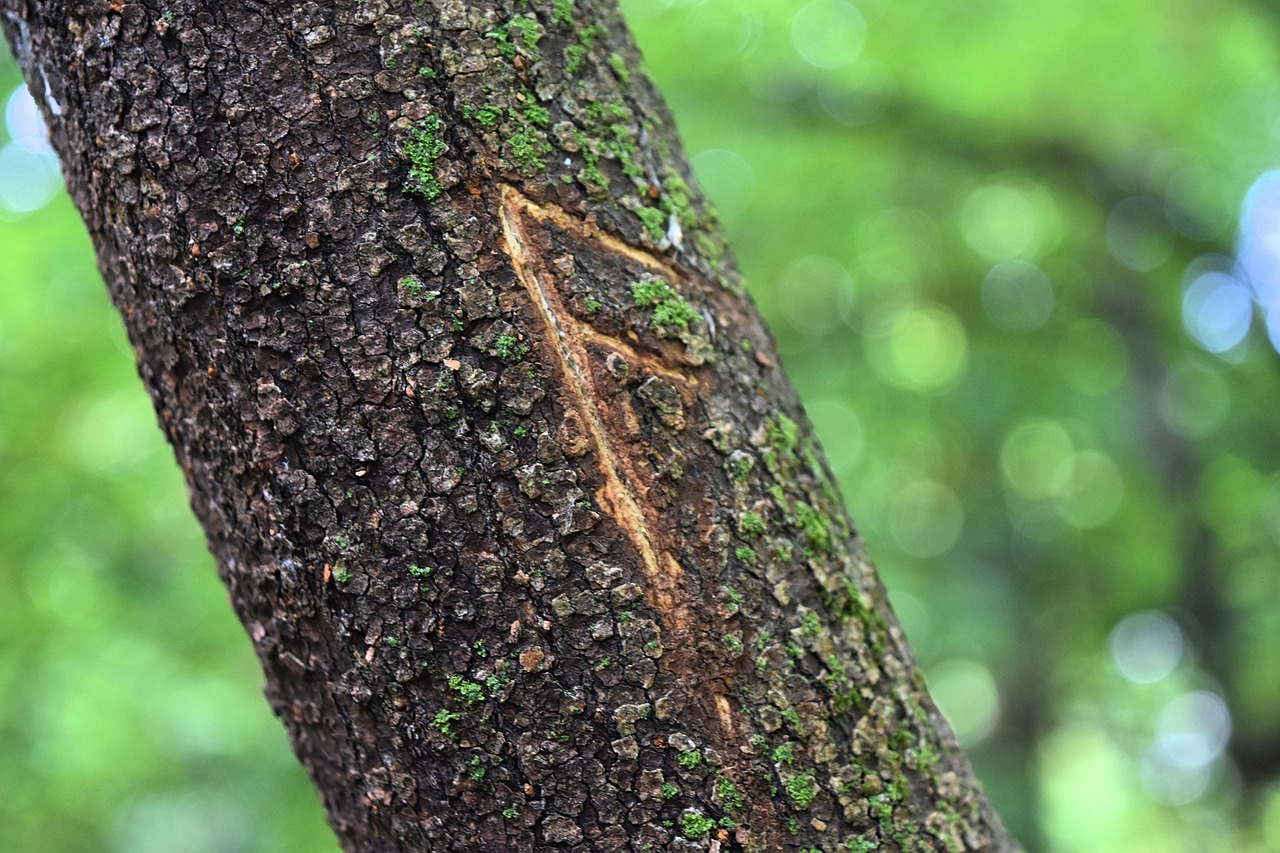
ᚠ The Rune – Fehu
At the base of the Runarbo logo is the rune ᚠ, known as Fehu in ancient Norse tradition.
Fehu stands for wealth, energy, and resources—but not in the modern sense of endless money or material things. It’s not about greed or excess. Instead, Fehu is about the kind of wealth that sustains life: food, tools, land, and knowledge shared within a community.
It reminds us that true value comes from what lasts—what we can depend on, care for, and pass down. Not the fast, disposable things that break or go out of style, but the durable, meaningful things that support a better future.
At Runarbo, Fehu is a symbol of this mindset. It helps guide our work as we look for products and practices that are rooted in real value, not just trends.
The Tree – Interconnected Life
At the center of the Runarbo logo is a tree—a simple, powerful symbol of life.
The tree represents stability, renewal, and growth. Its roots reach deep into the ground, drawing from tradition, knowledge, and humility. Its branches stretch outward and upward, symbolizing change, movement, and hope for the future.
Just like a healthy tree depends on balance between its roots and branches, we believe sustainable living comes from finding balance—between old wisdom and new ideas, between what we use and what we restore.
This mirrors our belief in systems thinking—understanding how everything is connected—and choosing long-term solutions over short-term fixes. At Runarbo, the tree reminds us to grow with purpose, and to stay grounded while reaching forward.
The Cicada – Patience and Transformation
Hidden beneath the tree in the Runarbo logo is a cicada—a small insect with a powerful message.
Cicadas spend most of their lives underground, growing slowly for years before they finally emerge. When they do, they shed their old form and transform into something new. It’s a symbol of patience, timing, and deep change.
At Runarbo, the cicada reminds us that real sustainability isn’t about quick fixes. It’s about long-term thinking, quiet progress, and transformation that takes time. Just like the cicada, we believe the most meaningful change often starts out of sight—and grows stronger before it rises into view.
The Color Green – Esperanto and Hope
The color green in the Runarbo logo isn’t just about nature—it has a deeper meaning.
Our green is inspired by Esperanto, a language created to help people connect across cultures and borders. It’s a symbol of hope, growth, and the belief that we can build a better future—together.
Green also represents renewal and life, making it the perfect color for a brand focused on sustainability and regeneration. But most importantly, it reminds us that climate solutions should be accessible to everyone—not just the wealthy, not just the experts.
At Runarbo, green stands for a future that’s open, fair, and shared—where anyone, anywhere can take part in building a more sustainable world.
The Font – Lato and the Meaning of Craft
The font we use at Runarbo is called Lato—a clean, easy-to-read typeface chosen for clarity and accessibility.
But there’s more to it. In Esperanto, lato means wooden plank—a piece of something useful, solid, and crafted by hand. It’s simple, but strong. Just like the values we stand for.
Using Lato as our font reflects the balance we aim for at Runarbo:
natural strength and human design, working together.
It’s a quiet reminder that even the smallest design choices can carry meaning—and that thoughtful simplicity is often the most powerful.
Conclusion – A System of Meaning
At Runarbo, our design choices aren’t just for looks—they’re a reflection of our values in practice.
Every symbol in our name and logo—the rune, the tree, the cicada, the color green, and even the font—has a purpose. Each one invites us to pause and think about what we truly value and how we want to live.
Because to us, sustainability isn’t just about choosing better products—it’s a way of seeing the world.
It’s a mindset.
It’s a philosophy of living well with less, choosing with care, and staying grounded while growing toward something better.
Comments are closed